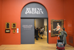
Caravaggio’s technique of using intense contrasts of deepest shadows against whites with moon-like colour came to be known as chiaroscuro. The overall effect is to charge the piece with drama and also create a sense of compositional volume. It was imitated not only by 17th-century artists such as Valentin de Boulogne and Jusepe de Ribera but also film noir cinematographers well into the 20th-century and even today. Pioneering movie director Cecil B. DeMille called it Rembrandt lighting but since Rembrandt was born in 1609 and Caravaggio 1571, the director was referencing the wrong innovator. However, this exhibition at The National Gallery focuses on his contemporaries who imitated those revolutionary techniques, which included a move away from classical themes towards naturalism and the use of live models.
The exhibition covers his creative evolution during his early years in Rome, when he produced paintings which show his preference for everyday subjects including card players, musicians and street fortune tellers. Artist Georges de la Tour paid homage to Caravaggio’s painting The Fortune Teller by producing his own in 1630 with the same title. In this work a naïve young man is being pick-pocketed by gypsies while having his palm read. Something of an obvious warning for the rich and unstreetwise. Caravaggio, however, sometimes worked a little more cryptically. In Boy Bitten by A Lizard (1594), the subject makes a grab for some cherries but all he gets for his greedy efforts is a lizard chomping on his finger. A warning here that sensual pleasures can often lead to pain, even where this is not immediately apparent.
Room 2 of the exhibition focuses on ‘Success and Patronage’ but again celebrates contemporaries such as close friend Orazio Gentileschi who used his techniques. In David and Goliath, Caravaggio’s trademark chiaroscuro lighting is no longer a stand out feature but the moon-white palette which the Master uses to represent holiness and reverence certainly is. Gentileschi was known to have developed a softer application of this use of shadow and highlights and this biblical piece is sizeable enough to showcase all the subtleties and idiosyncrasies of Gentileschi’s style.
Another considerably sized biblical work is Mattia Preti’s The Martyrdom of St Peter. Preti’s masterpiece outsizes even Goliath but itself is dwarfed by Gerrit van Honthorst’s monolithic and magnificent Christ before the High Priest, which almost touches the gallery ceiling – and this is no mean feat! You’ll notice that a good few feet of the painting’s size can be attributed to empty canvas space above Christ’s head. So considerable is that space that you sense it’s a deliberate device to convey volume similar to the foreboding environment in those corridors of law and power thousands of years ago. Not to mention the nuances of salvation also layered in that spacial metaphor. The subdued brown hues here are not as Caravaggesque as other paintings on display.
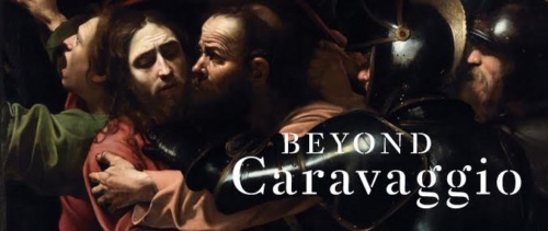
Having mentioned earlier how cinema borrowed its lighting from Caravaggio, the master artist himself does a Hitchcock-style cameo in The Taking of Christ (1602). Caravaggio depicts himself holding a lantern, as the Roman soldiers jostle around Christ as he receives Judas’ kiss of betrayal. The Caravaggio self portrayal serves two purposes: 1) The lantern he’s holding gives the painting its source of light 2) Caravaggio is able to put a very personal signature on the painting. Unfortunately, the exact reason why he chose to do so in that particular painting is lost in history.
Here as in other biblical works such as Salome Receives the Head of John The Baptist, there is much underlying violence and drama in the starkly lit, high contrast palette. (and the artist may well have drawn on his own experiences here. He once fled to Naples accused of murder!) A vignette around the main figures draws the eye beyond them, towards the grotesque severed head served on a platter. It is an intense composition despite its simplicity. The drama is evoked to a great degree by an uncompromising, unidentified directional light, rather than relying solely on gesture or narrative.
In this way it differs from the same subject matter painted by young pretender Mathias Thom. The gallery notes describe Thom’s version as more dramatic but one migbecause its lighter palette provokes less immediate gut-level reactions. Thom’s version makes you want to study it and remark on it – the detail of the wrinkles in the maid’s forehead, the subtler use of colour, the more entertaining composition. Caravaggio’s version makes you recoil in horror and feel a little drained, more than a little mournful….perhaps angry too. No time to count any wrinkles in any forehead while emotions such as those are pumping through your heart! So which one is more dramatic?
You can make your own mind up next time you visit the National Gallery to see Beyond Caravaggio. The exhibition is on from 12 October 2016 until 15 January 2017.