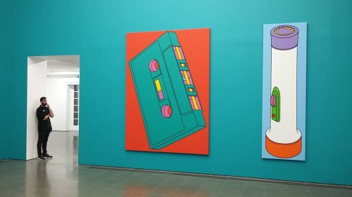
The Serpentine Gallery’s winter season features the work of Michael Craig-Martin, his first solo London exhibition for 25 years. This 1981-2015 retrospective will prove an interesting sensory experience for visitors because even the gallery walls are colour-coded to match the paintings. Yes green and pink walls. Bring the sunglasses!
Since his early career as mentor to Damien Hirst and the other Young British Artists (YBAs) at Goldsmith College Craig-Martin has explored the aesthetic power of everyday objects. Over a century ago Marcel Duchamp’s introduced this idea of making art from everyday objects, producing Readymade sculptures such as Bicycle Wheel which was no more than…a bicycle wheel. It made one question the labelling power of the artist and the function of the hallowed environment of the gallery space in defining art. Craig-Martin’s everyday objects are not untreated sculptures but paintings, so therein lies the distinction – a deliberate decision to beautify (unlike Duchamp). However, this has a two-fold effect. They’re engaging enough to draw in the average viewer without initial dissent (again unlike Duchamp) and enough of a challenge to make them ponder what is or isn’t art.
Every easily recognisable item of 21st century life is represented. Headphones, Xboxes, door handles, sports shoes many untitled but all unmissable in wonderful, in-your-face, cartoon-colour acrylic, blown up in size and solitary. As mentioned earlier, green and pink seems to be the favoured palette. An untitled plate of bright green potato chips a standard representation of fast food society were it not for their colour and the neon pink box they are served in. The gallery walls here are pink too. This, then, is Total art, with a very definite capital T.
Are all the walls colour-coded in this manner? You’ll notice a painting of a huge green cassette tape with its supply reel coloured yellow and set on a stark red background. The simple message here is colour. And yes even here the gallery walls are the exact same hue as the cassette. If you find yourself looking at the walls as well as the art, maybe that’s the point. As you double-take there’s that question about whether the walls are part of the work or just to make them prettier. There’s a definite design in all this colour harmony anyway. I suggest next time they paint the exterior of the Serpentine the same colour, the place will be packed.
The one exception from the theme of singular items is the totemic Eye Of The Storm (2003). This is undoubtedly the centrepiece of the exhibition and brings together all of these everyday items into a visual symphony. There’s an orange electric fan in its background which is positioned to look a little like the sun. The chaos of items in the foreground seem to be a celebration of the technological advances of the now but also have a disposal feel as many readily available modern items have. In this colourist wonderland they are strewn all over the place but still have an undeniable harmony.
Nothing looks out of place not even the bright orange cassette tape or giant yellow safety pin. You won’t even ask yourself why that blue bucket has a purple interior and contains a strange bright green liquid. As for that fan, on second glance it reminds you of one of those wind power turbines that are appearing eveywhere, so considering its sun/solar power theme perhaps its all a nod to a new horizon of more meaningful technological advances, the harnessing of sun power and other renewable energy sources. A dawn of new technology which will one day be so commonplace that it becomes the new taken-for-granted. But unlike the society which spawned Xboxes, sports trainers, computers and carbon-spewing aeroplanes and motor cars not so disposable.
Michael Craig-Martin: Transience runs at The Serpentine Gallery from 25 Nov 2015 to 14 Feb 2016 and is free entry.

